
Case Study
simplifi
simplifi is a budgeting app focused on a modular, educational approach to budgeting.
Design Roles
UX Research, Visual Design, Branding
Tools
Pen and paper, Figma, Usability Hub, Optimal Sort, paint.net, InVision, Maze
Deliverables
User surveys, competitive analysis, personas, user stories and flows, branding and style guide, wireframes, prototypes, user testing
Problem
Many people struggle with budgeting for a number of reasons. Either current tools don’t work for them, they’re nervous about facing the truth of their financial reality, or they simply have no idea how to start. No current budgeting app serves these markets and helps to introduce people to budgeting.
Solution
The solution was simplifi, a budgeting app prioritizing new budgeters while also providing useful tools for those with more experience. The primary goal was to provide easy access to budgeting by starting them off with three categories of expenses and the ability to set individual goals, then track their expenses by linking chosen accounts and analyzing their expenses in order to help them develop and specialize their budget, in essence teaching them how to budget.
Discovery & Strategy
The first step was looking at competitors to see what they offered, and where simplifi could find ways to attract its own audience. Of the current major options, we selected Mint, Wally, and You Need a Budget (YNAB), and then performed a SWOT analysis and found a couple of key opportunities:
- • Mint offers a look at your complete financial health, and is free but at the cost of ads and lacks a focus
- • Wally is a good mobile-first app with good foreign currency support, but it only offers snapshots of financial health, and the devs have stated they are working on premium features that will require subscription
- • YNAB takes a pro-active approach to budgeting, but has monthly subscription fees and is overwhelming for new budgeters
Strengths
- • Completely free
- • Total financial story
- • Credit tracking
Weaknesses
- • Bad synchronization
- • Spread out and not focused
Opportunities
- • Develop better synchronization
- • Develop stronger investment aspect or stronger budget focus
Threats
- • Apps that approach the same total finance package but offer better versions
- • Mint has basically been the same product since inception, while other apps have gone through repeated updates and iterations
Strengths
- • Completely free
- • Mobile first
- • Foreign currency support
- • Daily/monthly budget tracking
Weaknesses
- • New to the market
- • Offers solid snapshotting but little in the way of analysis
Opportunities
- • Focus on developing use cases wrt foreign currency could be the key to more widespread success
- • Develop analysis tools to help clients develop their spending habits
Threats
- • Delivering a feature-complete product with future “premium” content means that unless their premium options have very clear use cases, a new product that offers a better experience without premium subscriptions to maintain
- • A one-time purchase app can also threaten position, or alternatively an app that develops and adds on with explicit pieces/expansions that can be purchased at a minimum amount where subscription would cost more

Strengths
- • Heavily focused on budgeting
- • Different priority on teaching rather than set and forget
- • Driven approach
Weaknesses
- • Subscription model costs more than competing products
- • Heavy focus means scale cannot grow much
Opportunities
- • Could see expansion to more financial areas than just budgeting
- • Could develop a better security system via 2-factor authorization
Threats
- • A new app that is either free or a one-time purchase that also focuses on teaching could disrupt YNAB’s target market
Next we took a survey to determine how much space there was for an educational tool, and how many people even really look at budgeting apps to begin with. When we finished the surveys, we made a few key observations.
First, that of people who do budget, a surprisingly small number of our responders used any budgeting app. Many either used generic spreadsheets or did budgeting by hand.
What tools do you use to budget?
73.6%
Use generic spreadsheets or budget by hand
Would you use a budget app or software?
87.5%
Would use or consider using a budget app or software
In addition to the surveys, we ran a card sort to try and determine how people viewed and sorted a variety of purchases. In most cases, the responders divided the items into some variation of three categories, with varying labels.
User Personas
Using the data and some interviews, we created three user personas, each for a user at a different level of experience to encompass the different levels at which clients would engage with the app.

Motivations
- Danila wants something that won’t just set up a budget, but will actively teach about budgeting, and keep her from forgetting about it or from just simply ignoring her budget when it’s inconveniencing her. She wants something that will help her develop good and mindful spending habits going forward.
Goals
- • Wants budget reminders to acknowledge how on track she is
- • Wants more involvement than set and forget
Frustrations
- • Feels like no program offers a way of helping to develop or improve budget skills

Motivations
- With his recent change in income and priorities, Nick is now looking to start seriously putting money away for retirement and also set aside money for hobbies. He’s satisfied with the program he’s using, but likes to try new programs to see if something better is out there.
Goals
- • Wants help in aggressively budgeting to set money aside for his goals
- • Wants something that is able to help him analyze his progress toward those goals
Frustrations
- • No program really offers an analysis and ways to improve on his current spending to meet or exceed goals

Motivations
- Sam and Mary want to start putting money away to keep themselves financially stable in the event of an emergency. They also want to be able to do things they enjoy, both separately and together.
Goals
- • Want a firm financial picture
- • Want solid guidance and some automation
Frustrations
- • Feel like it’s hard to get a constant and consistent picture of expenditures month over month to develop new spending habits
Stories, Flows & Architecture
Next, we modeled user stories and user flows based on those profiles and survey responses. These stories and flows were primarily based on the straightforward usage of a budgeting app, but high priority stories were split between new and general/advanced users.
| Role | Task | Importance |
|---|---|---|
| As a new user | I want to create a user account | High |
| As a new user | I want to enroll a bank account | High |
| As a new user | I want to create a budget through budget items | High |
| As a new user | I want to see an analysis of my spending after the first month | High |
| As a general user | I want to enroll additional accounts | High |
| As a general user | I want to adjust my budget items | High |
| As a general user | I want to edit/delete my accounts | High |
| As a general user | I want to edit and change my goals | High |
| As a general user | I want to add new budget line items | High |
| As a new/general user | I want to receive push notification on purchases showing my remaining budget for that category | Medium |
| As a new/general user | I want to see quick digestable stats per month | Medium |
| As a new/general user | I want to set specific success milestones | Medium |
| As a new/general user | I want to see suggestions for tweaking my budget in the event of consistent overspending | Low |
| As a new/general user | I want to see 3-, 6-, 9-, and 12-month analyses | Low |
| As a new/general user | I want to divide purchases into multiple categories | Low |
| As a new/general user | I want to automatically sort recurring purchases | Low |
| As a new/general user | I want to set up scheduled transactions | Low |
| As a new/general user | I want to categorize transaction types | Low |
| As a new/general user | I want to enroll retirement accounts | Low |
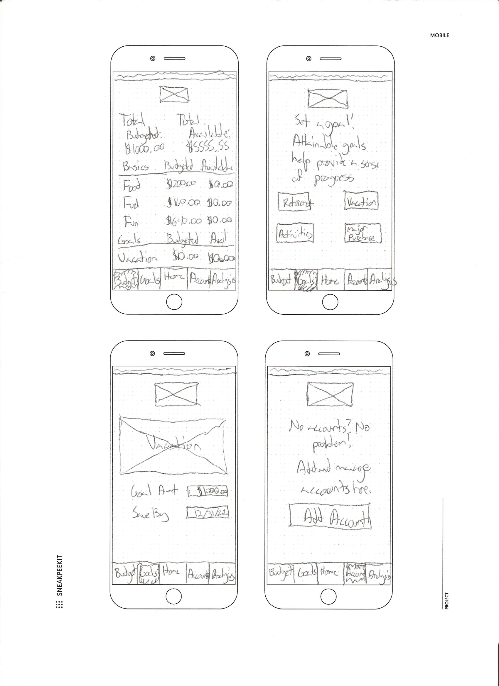
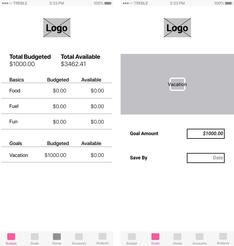
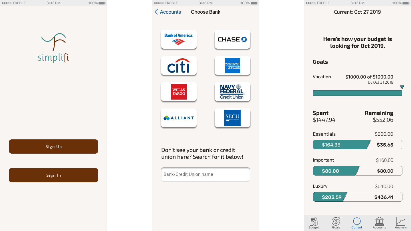
Wireframes, Lofi Prototyping & User Testing
The first round of wireframes was designed specifically for usability, to attempt to put to paper (so to speak) the user flows above while trying to flesh out the basic design of the page.
We conducted our first round of testing here, with four tasks:
- • Sign up for an account
- • Add a bank account
- • Set a goal
- • Edit a budget line item
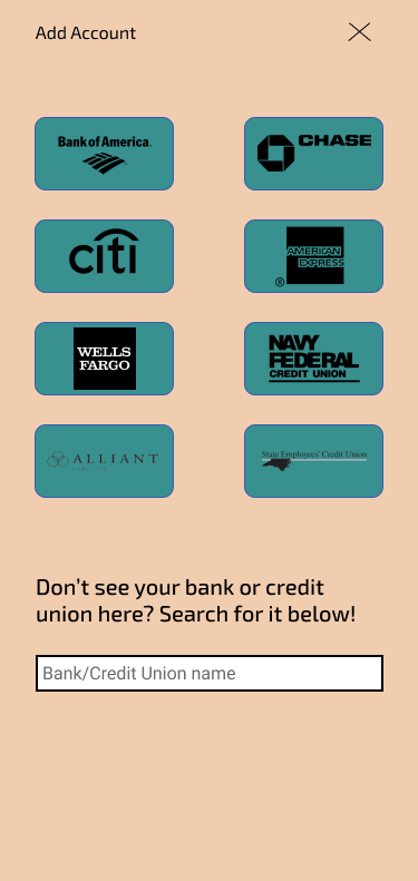
This first prototype ran afoul of users almost immediately. When conducting a Maze test and in-person testing, the Add Account page was poorly explained and resulted in a mere 33% success rate on the page.
This necessitated a revision.
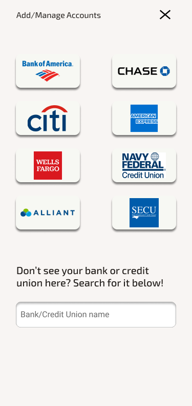
The revision worked better. However, outside of the Add Account confusion, there was very little confusion. Users had no real issue, and there were some good reviews, specifically one user mentioned that he appreciated the ability to set an end date to the goal as a way to help measure concrete progress.
Once the Add Account page was fixed and flows were re-evaluated and confirmed to work as intended, we were ready to step into branding.
Branding
First we started with brainstorming on the app using a mindmap.
I started with the concept of zen, which branched off into mindfulness and calm, which are core elements of zen, as well as the Japanese word “anzen” which means safety or security. These would become watchwords for the mood I wanted to create, and they helped me to define the product, which at the time was nameless.
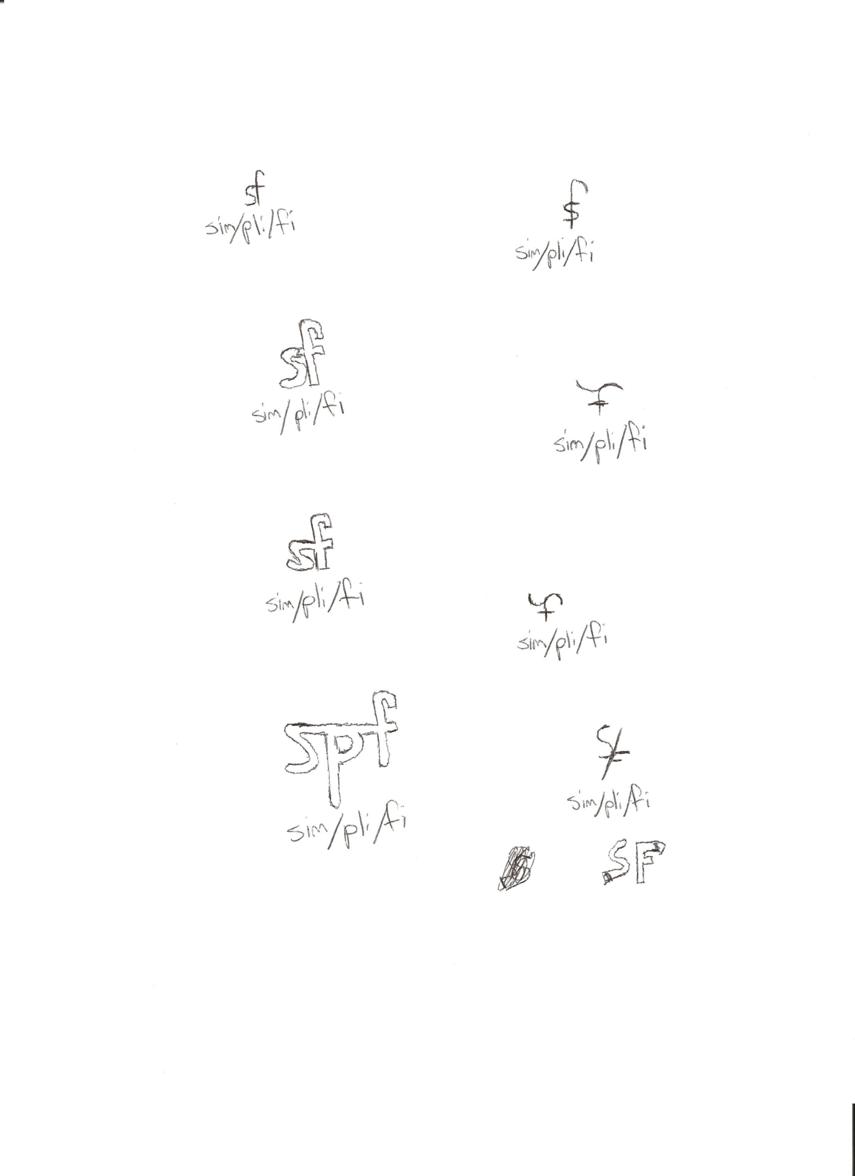
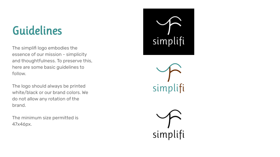
Logo Design
Next I worked on logo design, which also helped me to workshop names. I hit on a number of concepts, though the word “zen” was still at the forefront of my thought process. So most of my
early attempts had some play on that word.
Eventually, I pivoted to the concept of simplifi, here shown as being conceptually divided into three per the three categories from the card sort. However, I settled on something a bit
less convoluted and more straightforward:
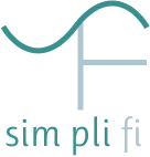
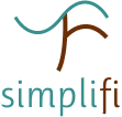
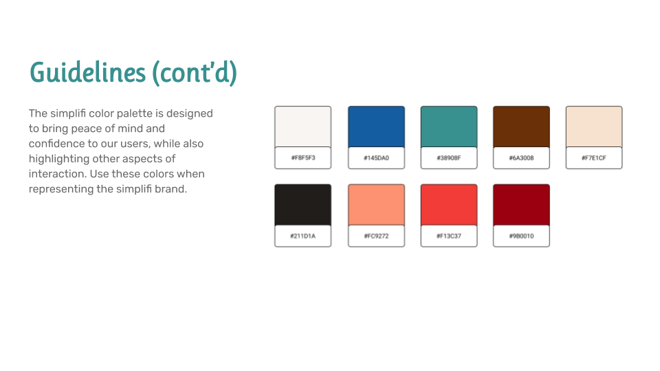
The palette was tied to the concept of simplicity. The original attempts focused on earth tones and pastel colors, but did not convey the desired mood. Instead, we shifted toward a more neutral presentation with a couple of deep, rich colors designed to remind of home, comfort, and stability while still promoting the concept of growth and education. The green and brown here, in a design that merges the s and f while resembling a tree, reinforced that.
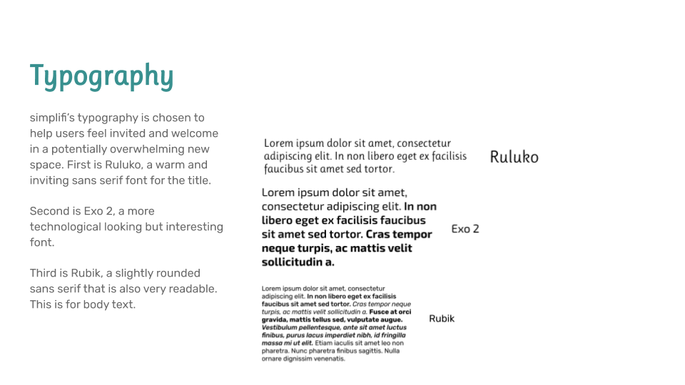
Style Guide
This also came with the creation of a complete style guide that included choices of typography.
Visual Design
After settling on a defined identity, palette, and mood, we went into high-fidelity mockups, taking our refined mockups and feedback and combining them to create a finished product.
User-Driven Development
The second round of user testing focused entirely on aesthetic and usability. While the original issues had seemingly been addressed, we wanted to ensure that there were no further issues, and also test out the analysis portion.
For the second test, our testers were asked to perform a similar set of tasks to the first, but then were also asked to go into the analysis and view a one-month analysis of their spending.
Users responded very positively to the testing, and particularly to the analysis page. There were no hiccups regarding the user flows, and users felt very much at home with the coloration of the app. The biggest suggestion was about the possible use of widgets to help guide new users, but as there were no hangups in the testing this suggestion was ultimately not considered for the MVP.
Before
After
Conclusion
All told, I feel satisfied with the final result, if not entirely with the road it took to get there. My initial vision for the final project, using the sandy-brown color for a background,
backfired significantly, as very few people were receptive to the design. I appreciate the final product as it is, it’s a very streamlined and stylized product that encourages thoughtful
interaction, which I want to make the hallmark of my design style. My concern is how much of that was me and how much of that was the input I received. And whether that even makes a
difference.
What surprised me the most was how quick I was to bounce back and implement much of the feedback I received. I feel that even moreso than my first outing, I was able to conceptualize and
act on the key elements of design in this product.
Going forward with this product, the key things I would do would be to set a pricepoint - I’d want to avoid the ad-based revenue of Mint, and subscription services can feel predatory.
Instead I would want to make the app free to a point, with a one-time purchase to unlock the analytical capabilities of the app. This could also potentially lead to a tie-in with local CPAs
who might be able to provide extra extended analyses to clients.
Personally moving forward, I would like to develop a stronger sense of aesthetics in order to avoid missteps like the one I made in the middle of my development here with the color palette
and the application of that palette. I feel that it will require a good deal of work to fully realize exactly how these discrete elements come together and how they should be applied, and it
is something I will work on going forward.